

The development of Colere's new brand identity stems from an ambitious project to enhance the entire Scalve Valley. The first step was to define a strategic plan with the research of naming, payoff and implementation of online communication, also in anticipation of the restyling of the three refuges in the area
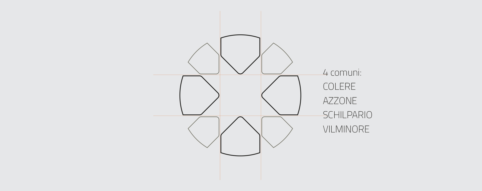
The morphological study of the territory gave rise to the logo sign:
Colere is located on the north side of the Presolana, a mountain
characterized by a massive wall of compact limestone alternating
with crests and towers. From here comes the sign composed of
several 'spires' and the payoff 'Infinite mountain' that underlines its
identity.
Colere has also always been an important extraction site
for fluorite, a mineral that presents a visible fluorescence
phenomenon under ultraviolet rays, a color that communicates
energy and vitality, which has therefore become one of the brand's
colors.
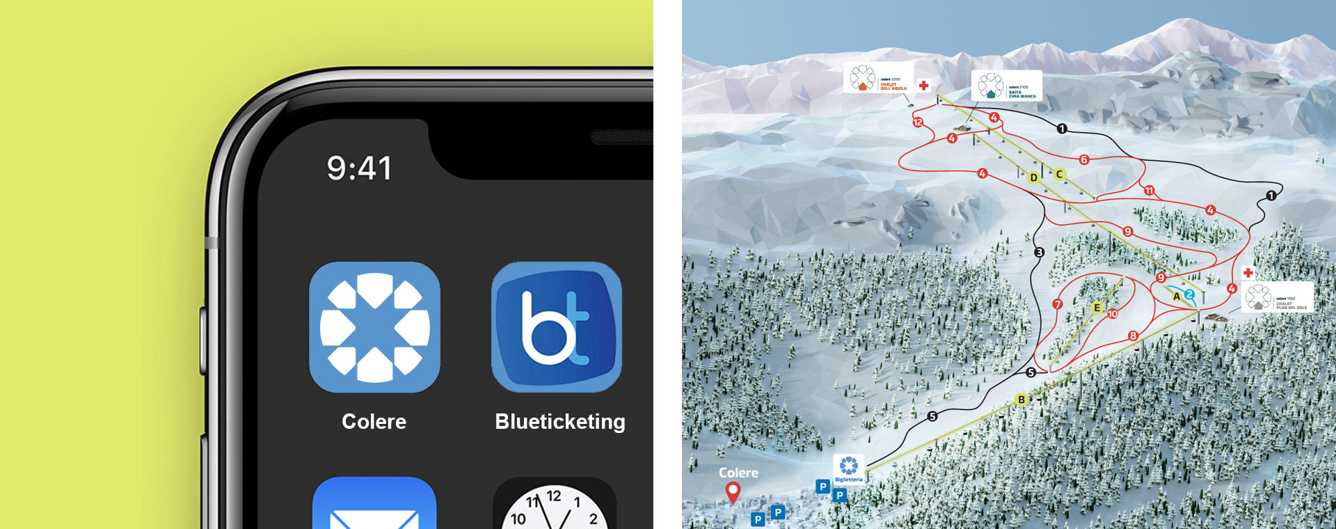
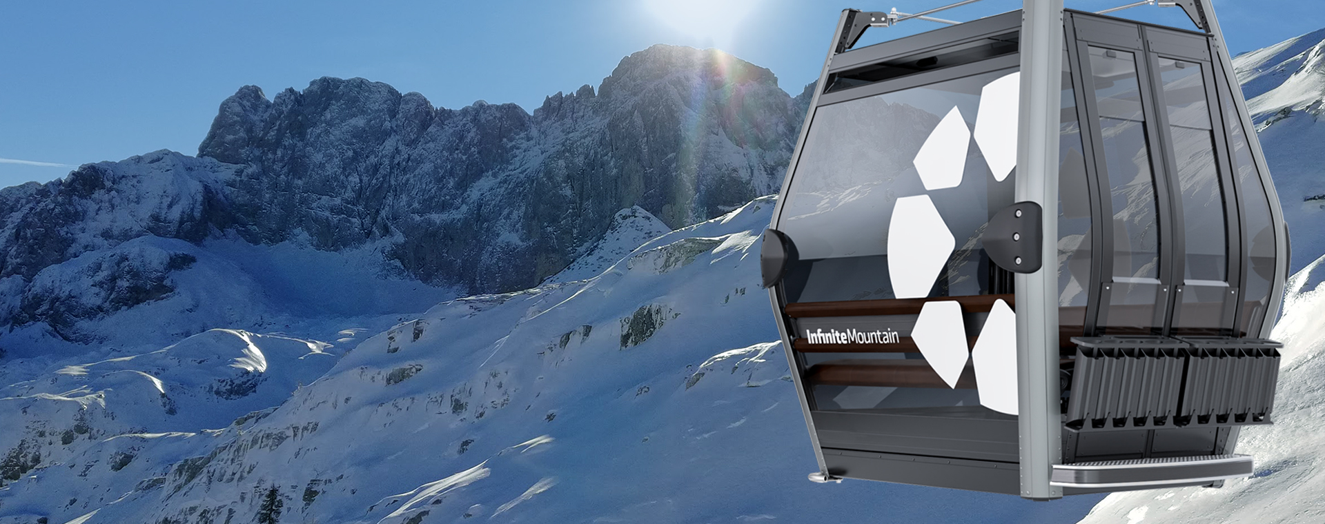
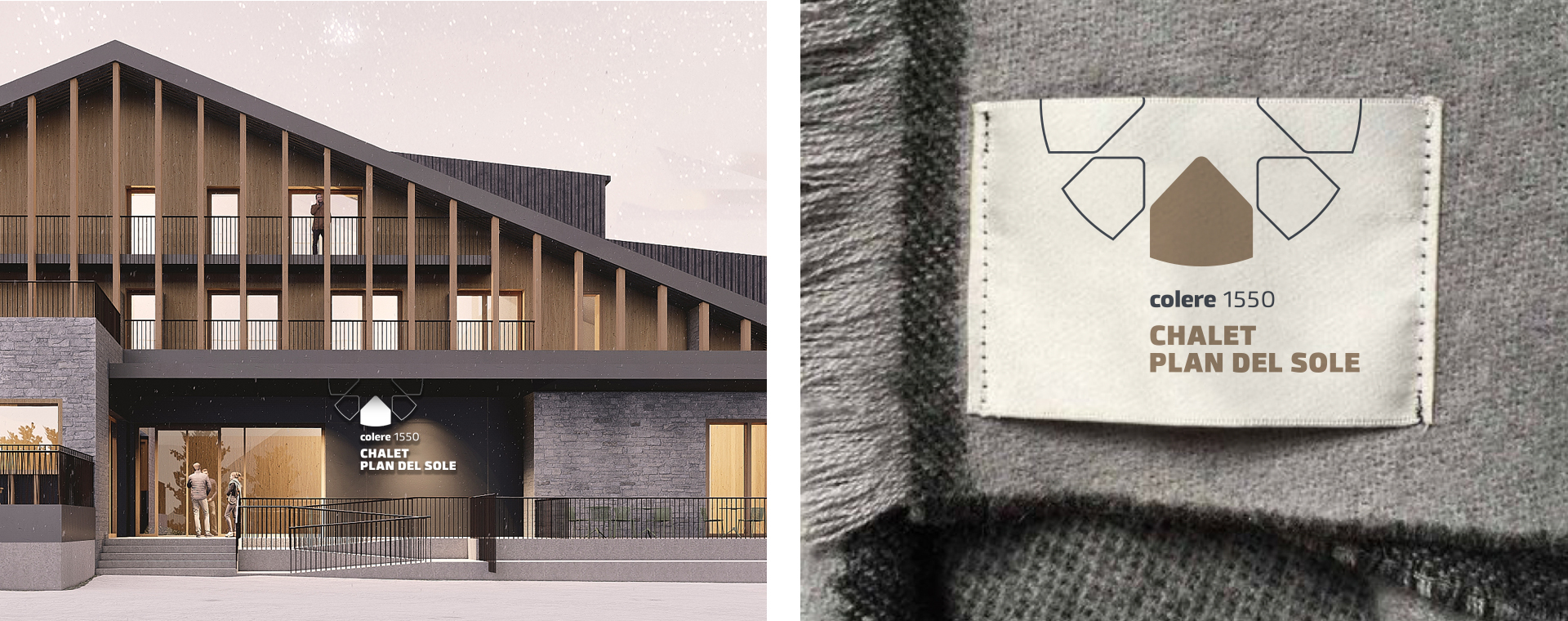
The website was developed with the aim of enhancing the natural heritage of the context through a quality offer, thanks to the new ski lifts, completely renovated. The livery of the cable cars and the logo of the three refuges are characterized by a contemporary minimalism.
For more information or to develop a similar project, contact us